Here's the launch page. Here's the report itself [pdf]. I have only skimmed the report, and I'm parking it here for future reference -- it has tons of data, and more importantly, it has citations to other studies and primary sources of data. It has fancy pictures -- especially in Chapter 2 (but none of those pics comes close to this beauty).
I was surprised to learn this:
Over a third of all articles published in international journals are internationally collaborative, up from a quarter 15 years ago.
The Royal Society has this interactive infographic on the level of collaboration by scientists in many countries. Watching the points on the scatter plot move with time is pretty mesmerizing!
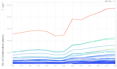
Do play with the graphic -- it gives you many ways of seeing the data. [While it's not quite in the class of Hans Rosling, but it's almost there!] Take a look at the line plot (click on it to see a bigger version):
In the figure, the US is right at the top, followed by the UK, Germany and France. While the long-term trend is positive for all the countries, we can also see a steady dip over a 3-year period (1999-2001) followed by a huge, ~50% increase in just one year (2002-03).
Are these short term swings real, or are they a result of some quirk in the Scopus data? If they are real, what might have happened during 1999-2003 that could explain them?

0 Comments:
Post a Comment